Mindin
Responsive web app dashboard for cultivating goal orientated connections.
Client: Passion Project
Role: Sole UX/UI Designer
Toolkit: Figma, Miro, Zoom, Google Forms
Duration: 2 months
Background: Mindin is a mental health app designed to support individuals through life’s challenges, especially during the global pandemic. Using mood-tracking tools and social features, Mindin aims to provide accessible mental health assistance and connect users to supportive communities.
Coming Soon…
Challenge
The rise in mental health challenges, increased by the global pandemic, has left many individuals struggling with overwhelming emotions they cannot easily understand or address. This highlights a need for accessible support solutions for those unable or unsure of how to seek help. The goal is to create a solution that offers effective support for individuals facing these mental health challenges.
My Impact
Mindin offers a reliable and safe space where users can remotely access mental healthcare, providing digital resources and professional guidance when they need it most. By enabling secure and simple communication with mental health professionals from home, Mindin not only supports users' mental well-being but also helps reduce the spread of COVID-19 by minimizing in-person appointments.
In every part of my research, I realize that many individuals during the pandemic have struggled with mental health issues. The main concerns were caused by isolation and fear of being infected by the virus. Quarantine forced many people to be apart from their loved ones and made them feel all alone with their negative thoughts, without receiving the attention they needed to get better.
I learned about 3 main problems:
Unaware of the importance of self-care:
It can be something very difficult for certain people to maintain a balanced and healthy lifestyle. The challenges of COVID-19 have made self-care more important than ever since it’s a priority to stop the spread by keeping yourself in check. Several people around the world don’t have the correct information or advice to develop good daily habits.
Difficulty with receiving professional assistance:
Frustrations with receiving emotional support which causes users to want to take matters into their own hands. 47% increase in major depression and anxiety rates due to feeling loneliness from social isolation. (cnbc) Millennials are more likely to go online rather than receive medical advice from a therapist.
Lack of socialization:
Understanding the reasons behind social distancing to staying healthy and safe during work and off times. Many struggles to maintain a social life while others have difficulty meeting up with new people due to the pandemic.
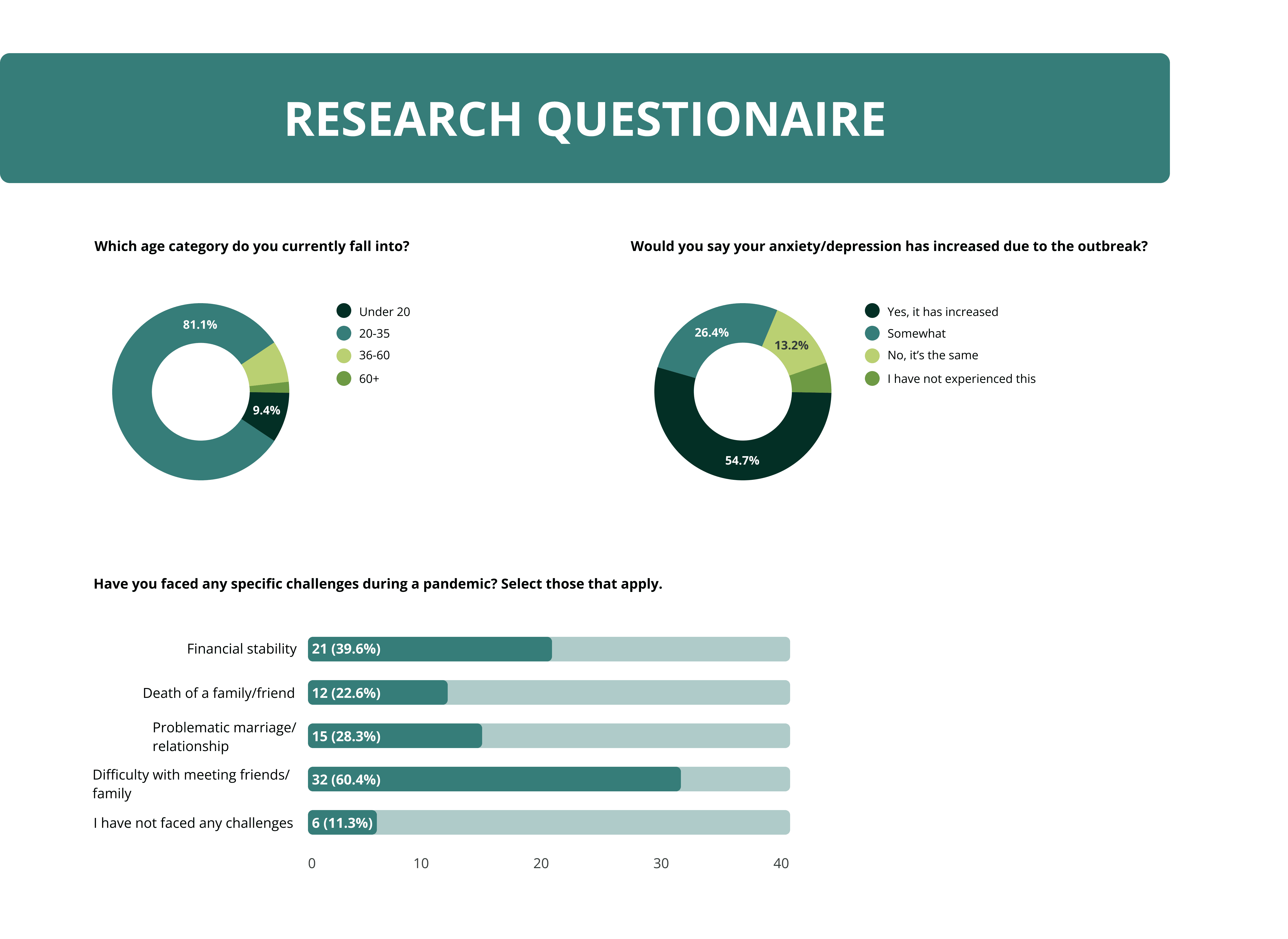
Secondary Research
Survey research goals:
To target an audience between ages 20-60 that understands these 3 main problems and sees the differences in their attitudes. Discover their frustrations during the pandemic to determine a possible solution that may meet their needs.
Survey results:
I gathered 53 responses and was able to interview 5 participants that met my criteria. To conduct interviews I used Zoom or Discord, and Otter.ai to transcribe for better note-taking ability. Focusing on the topics of difficulties with mental health experiences during the COVID-19 outbreak.

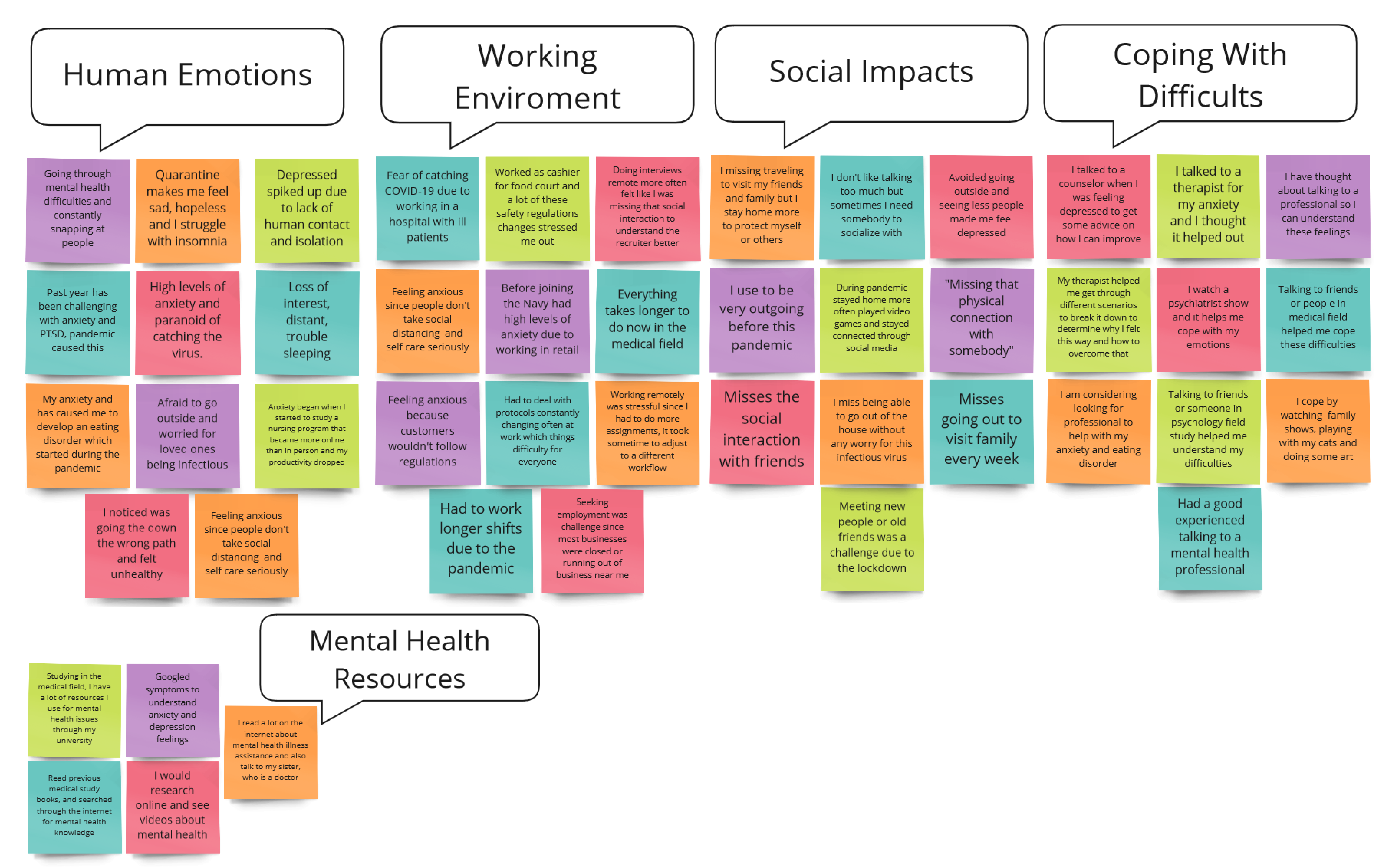
Synthesis Affinity map
Most participants say their anxiety and depression have increased and they wish to seek out professional assistance but they have a busy schedule and don’t want to spend too much time commuting to talk to someone for long periods.
Participants miss having human interaction and feel like they are ignored since they aren’t receiving it. The shift to working remotely was difficult for some of them since they normally worked on-site and felt that they received more attention in person than remotely.
They generally like the idea of using social media to communicate with their peers but some also wish they could meet new people with similar mental health experiences to seek out advice.
Empathy Maps
Visualizing how a user feels is important to put yourself in their perspective to better understand how to approach a design decision and consider solutions to the problem.
The first empathy map created is for The Struggling Worker. This activity was a way for me to understand what the user is feeling, and think what their thought process is like to guide me in creating a visual persona.
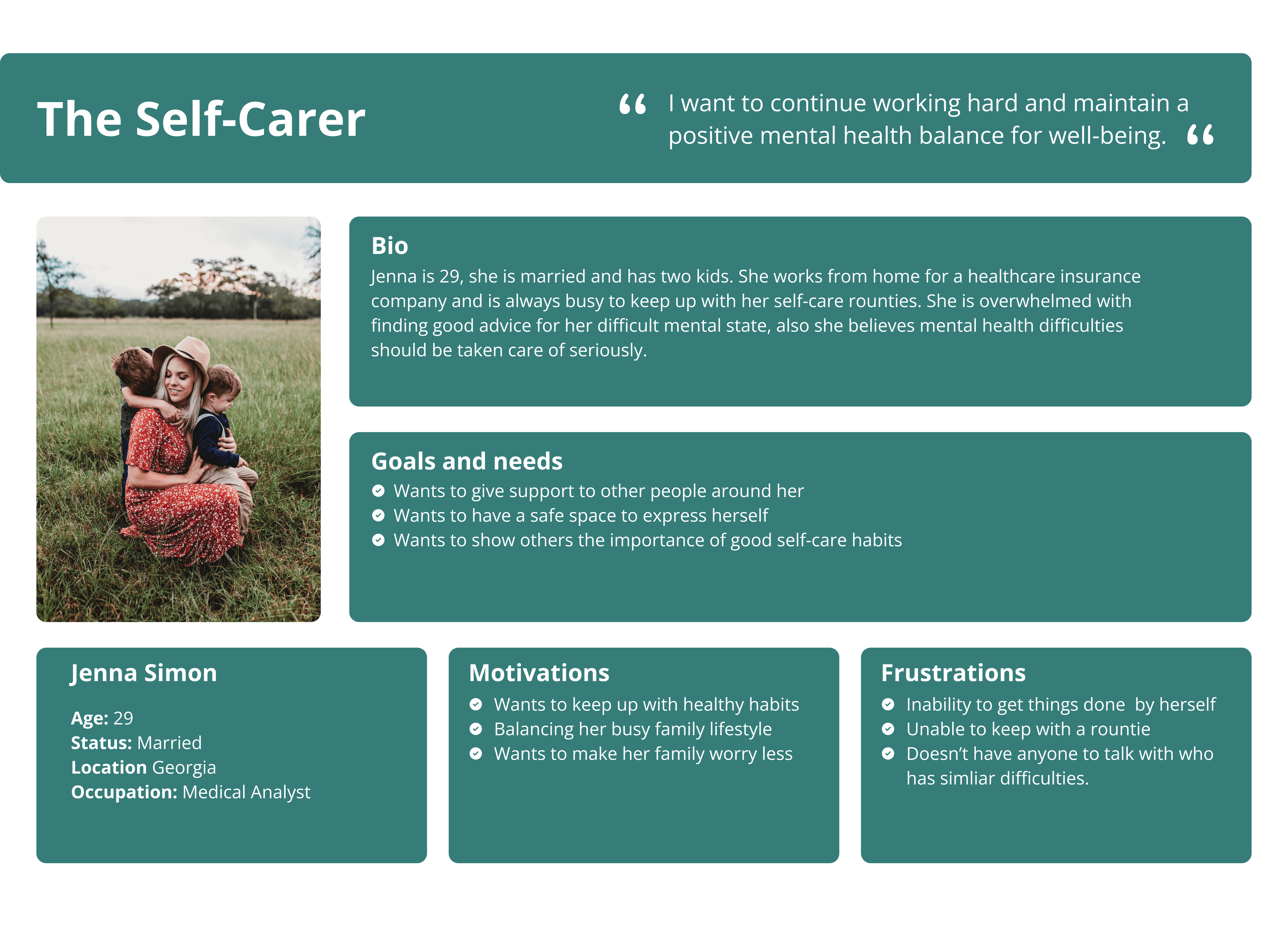
The second empathy map created is for The Self-Carer since I wanted to understand how they want to feel safe and confident in their self-care habits. This allowed me to grasp how I can approach different methods to make this experience better for The Struggling Worker and The Self-Carer.


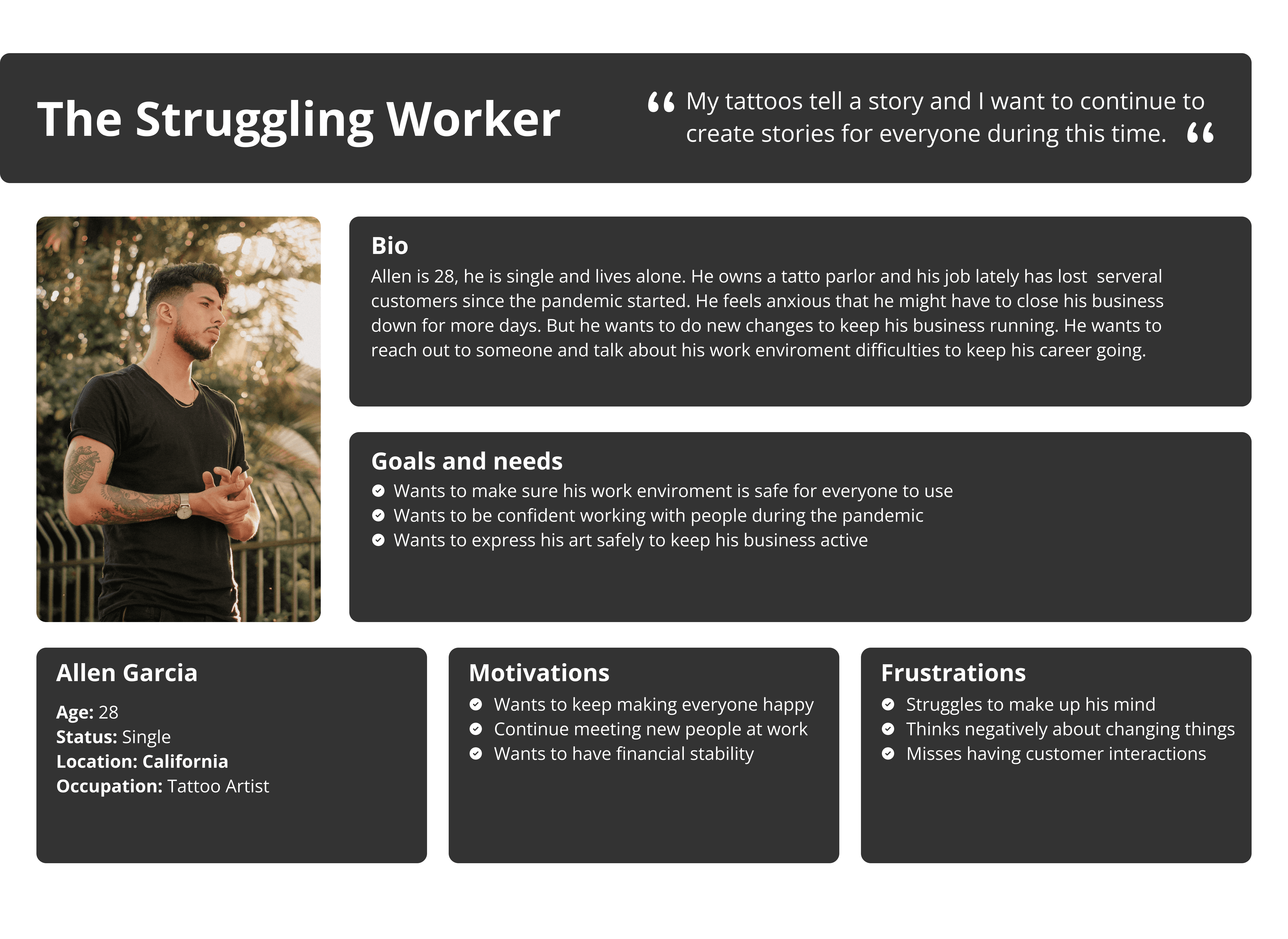
Personas
I developed two personas to help me identify two different perspectives.
The first persona I created was The Struggling Worker. I wanted to see how they demonstrated their motivations and frustrations by putting myself in their shoes. I wanted to see how Allen Garcia felt during the pandemic lockdown and how his work life changed.
The second persona I created was The Self-Carer. It is important to see how someone with a busy lifestyle tries to keep herself healthy even though Jenna Simon is a mother of two kids. We know how busy that is especially during the pandemic. She works from home and struggles to manage a good mental health balance for her family.
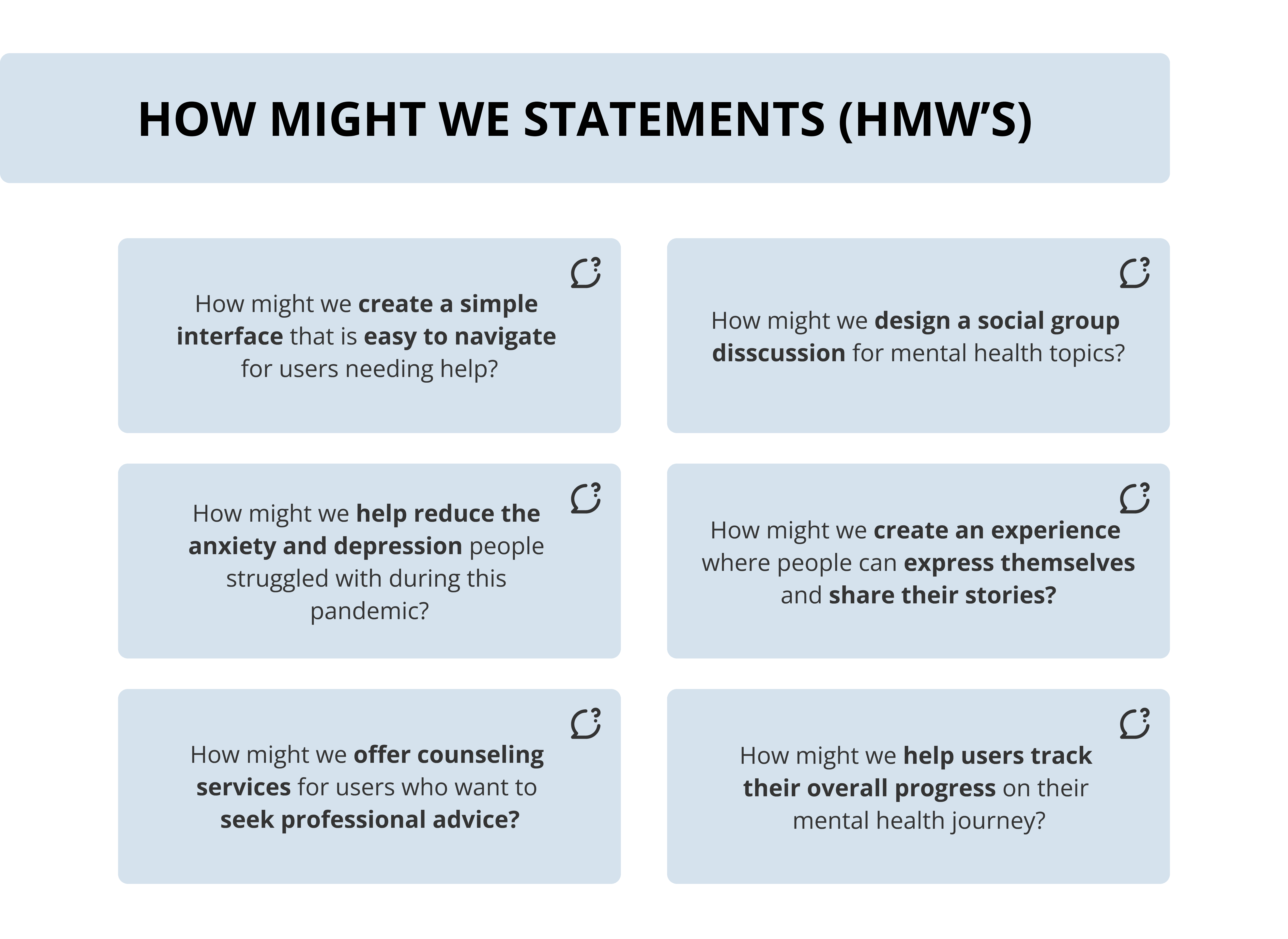
HMW
How Might We Statements is an activity that I formulated to compile different ideas for each problem users want to be solved and then I can create a better approach for my design solutions.
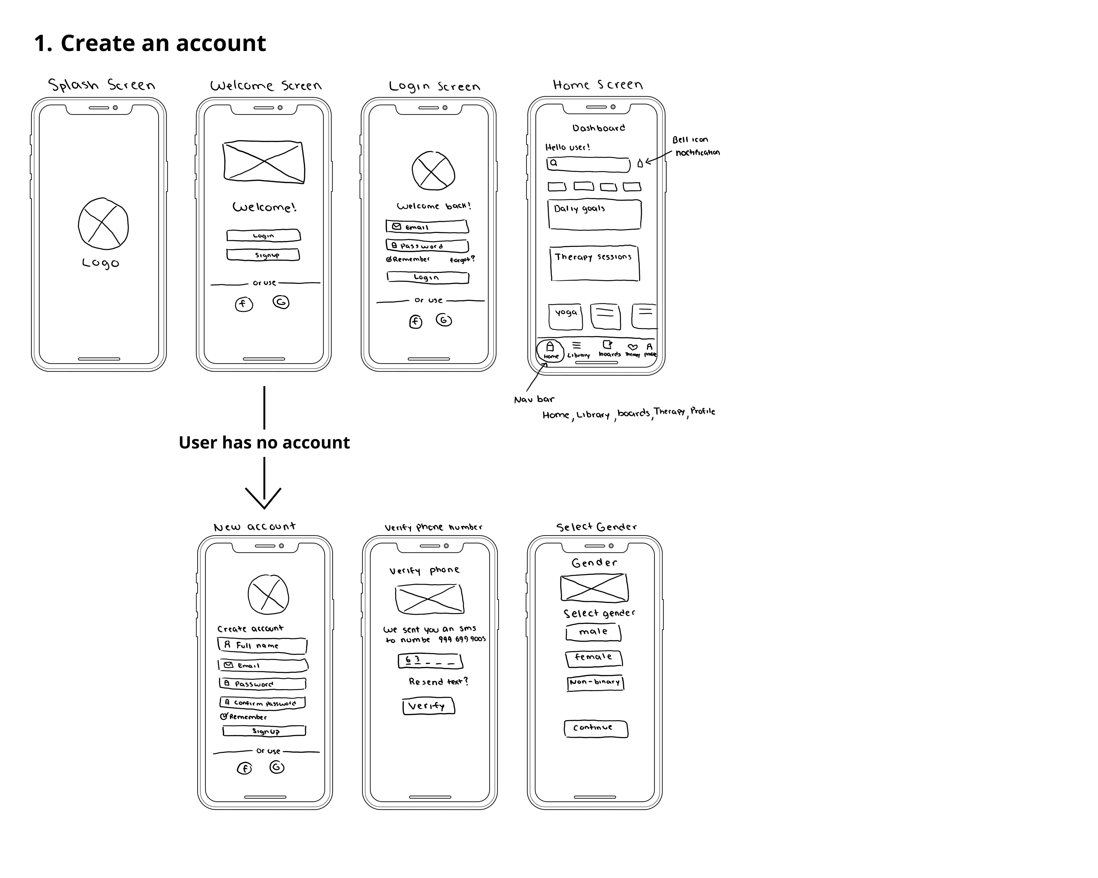
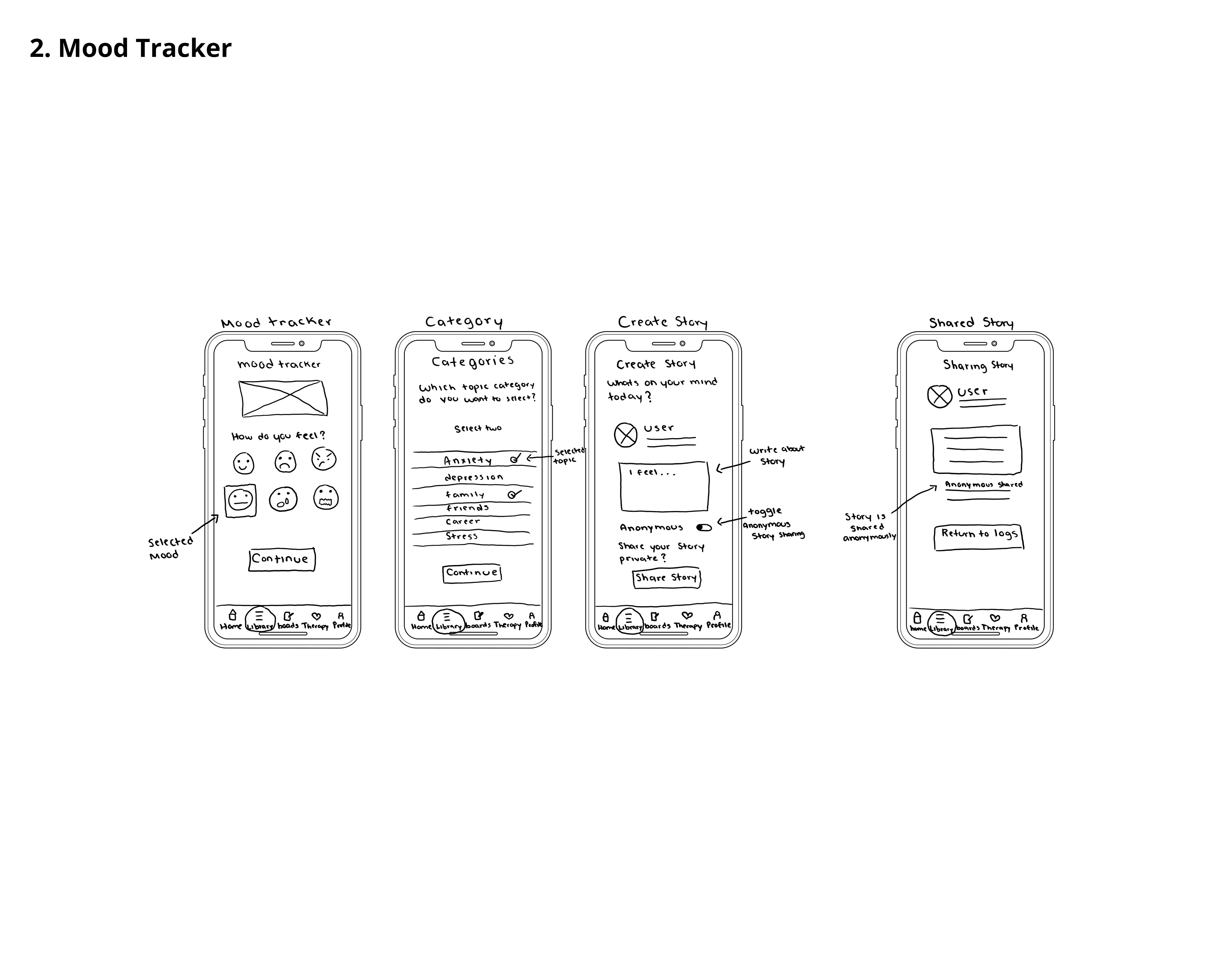
Sketches
I decided to create a test design by sketching on my tablet a few screens with my ideas. Here I demonstrate various paths a user will take to achieve certain tasks with the application. This concept helped me realize my design thoughts and what changes I could possibly make later.
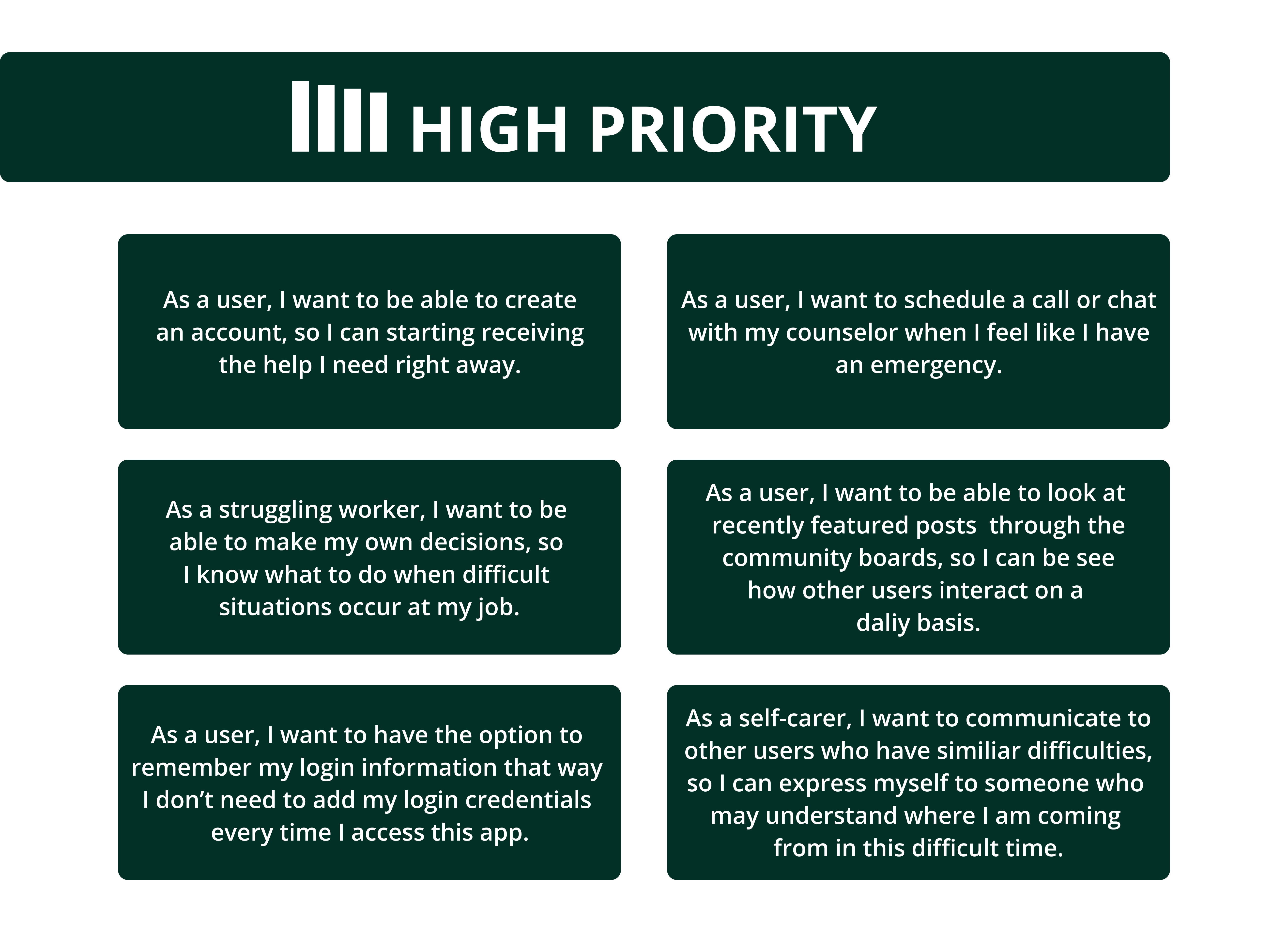
User Stories
I made these user stories a great way to see how the user is trying to accomplish something by using the product features of the app and achieving a goal.


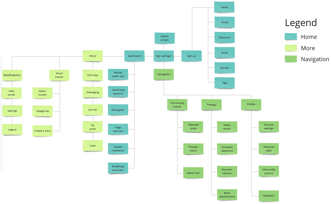
Site Map
Now with the information, we have so far I have created a sitemap that outlines the core features needed to create this application. The legend contains a Home screen that indicates what the user will first see once they sign up/login into the app. The More is a navigation menu containing other possible features the app could have and the Navigation bar are the rest of the features the app will consist of which will be located at the bottom.
User Flows
I developed 4 red routes to determine each step taken for each feature that will be implemented to help me create a specific design process in an organized manner.
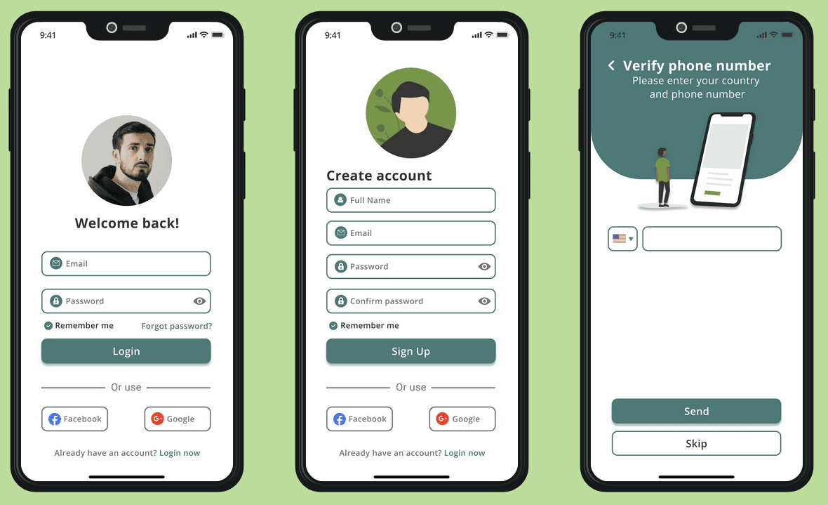
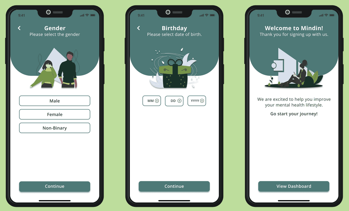
Flow 1: The user will be guided through a sign-up/login screen sequence.
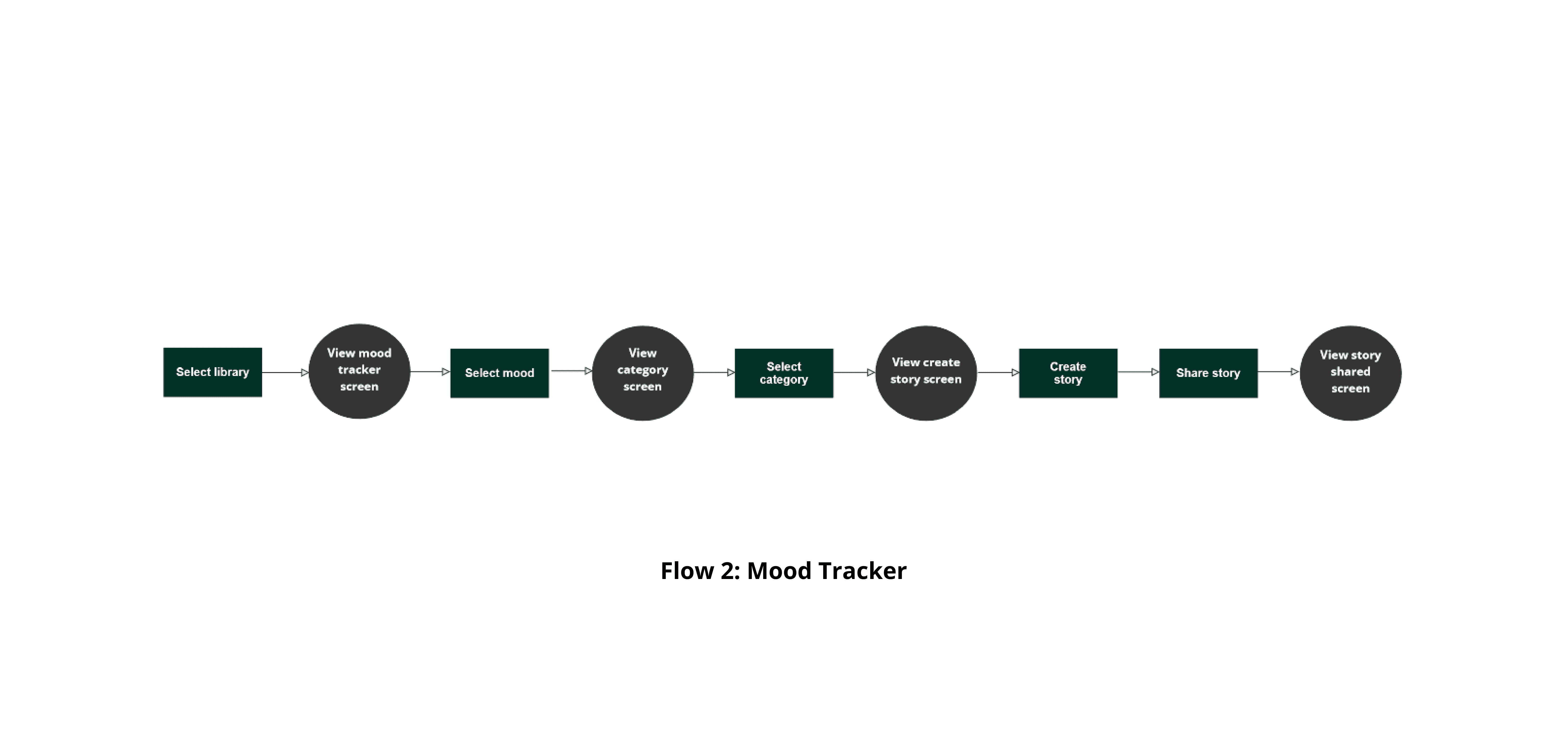
Flow 2: The user will express their daily mood followed by creating a story post and sharing it.
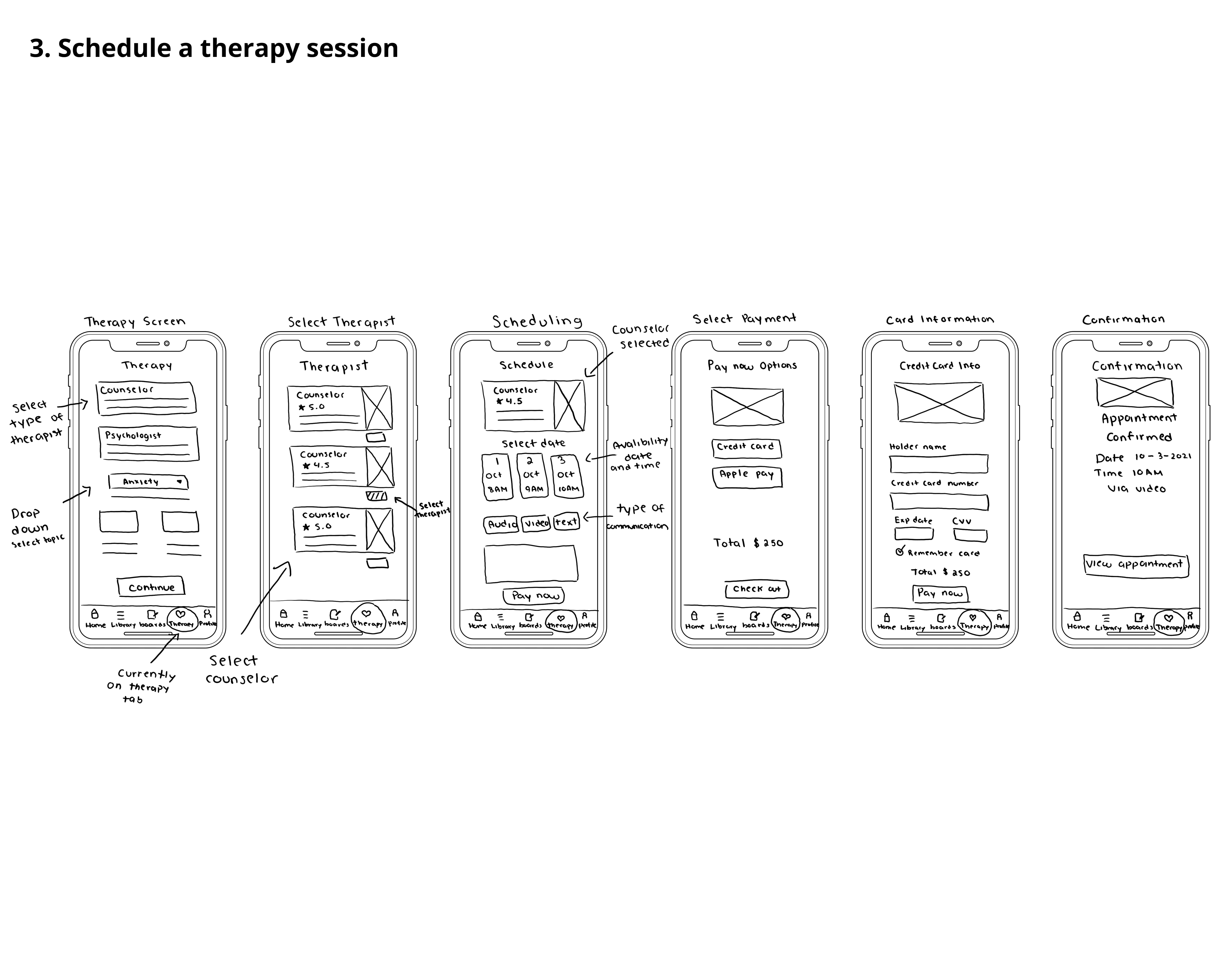
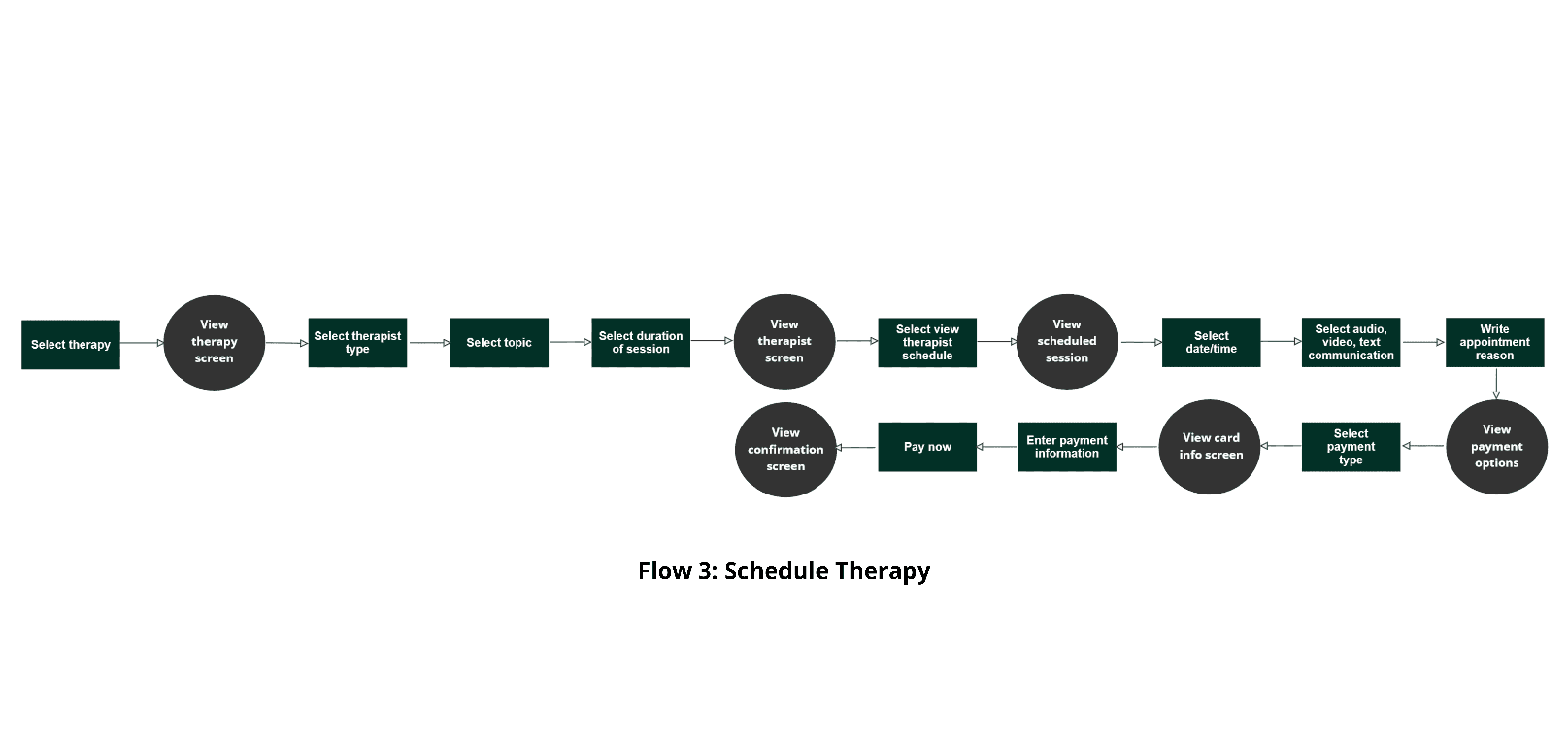
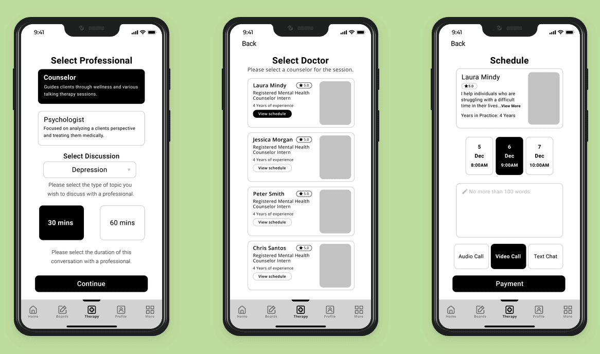
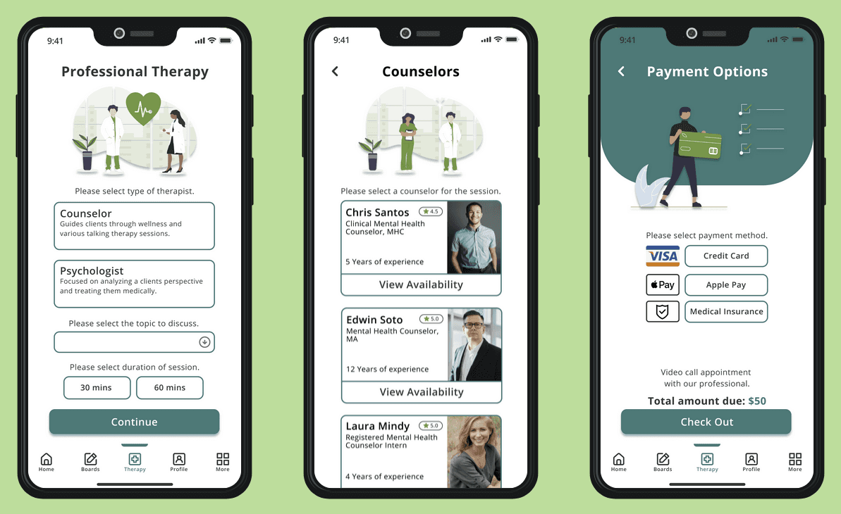
Flow 3: The user will choose therapist type and select therapist, select their availability schedule, and then continue to proceed with the payment process followed by receiving a confirmation.
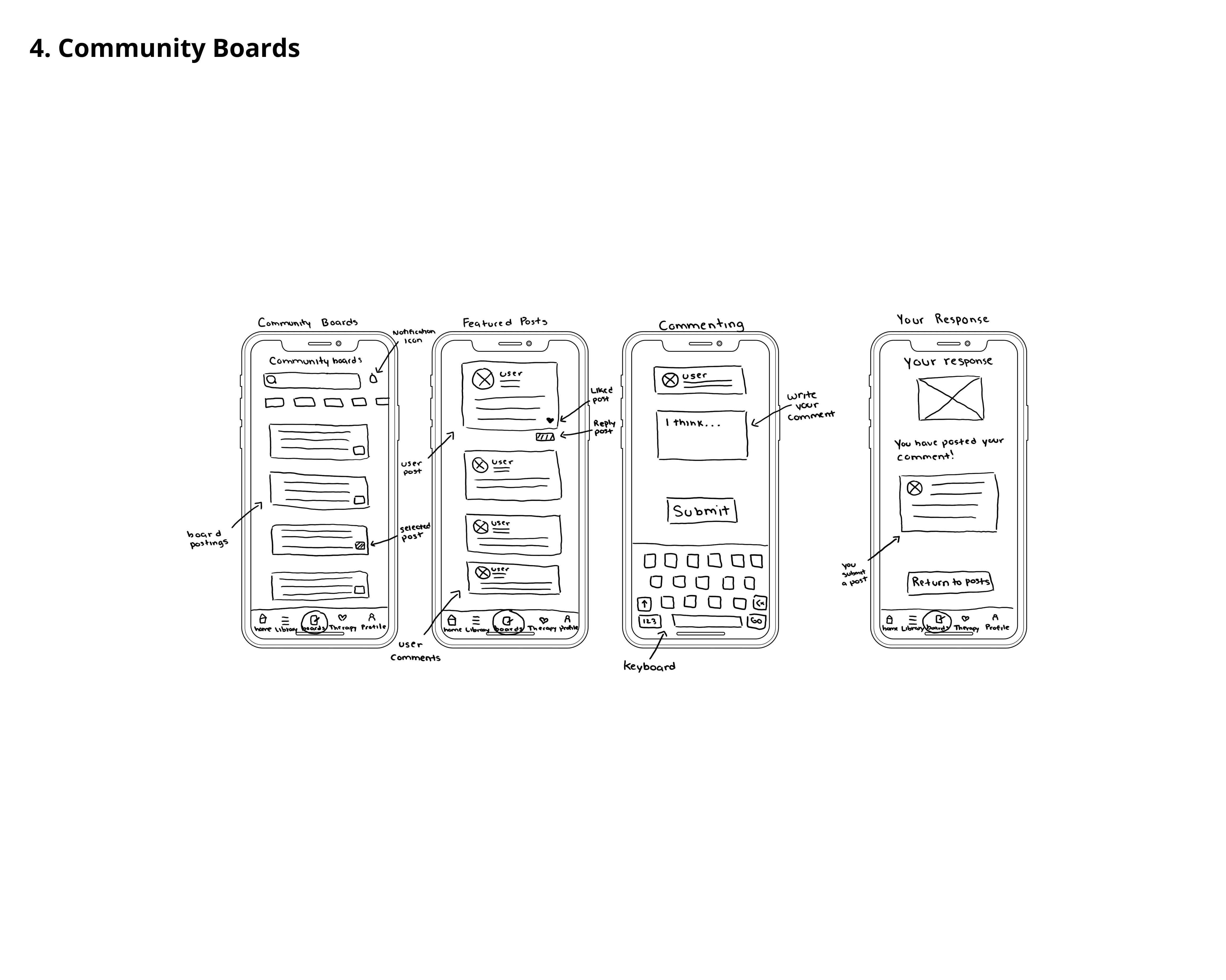
Flow 4: The user will navigate through the social community boards by reading a post and commenting on a reply.


Wire-frames
My design decisions were to create these 25 mid-fidelity wire-frame screens using my previous sketches, personas, and user flows as a reference. Throughout this process, I was able to determine what features will be implemented in the mobile app to ensure that the designs are intuitive to users with mental health difficulties. Once I developed these designs in Figma, I created these mid-fidelity screens so that it will be easier to look back at these screens later and understand the design process I am trying to achieve in the next stages I will be designing.

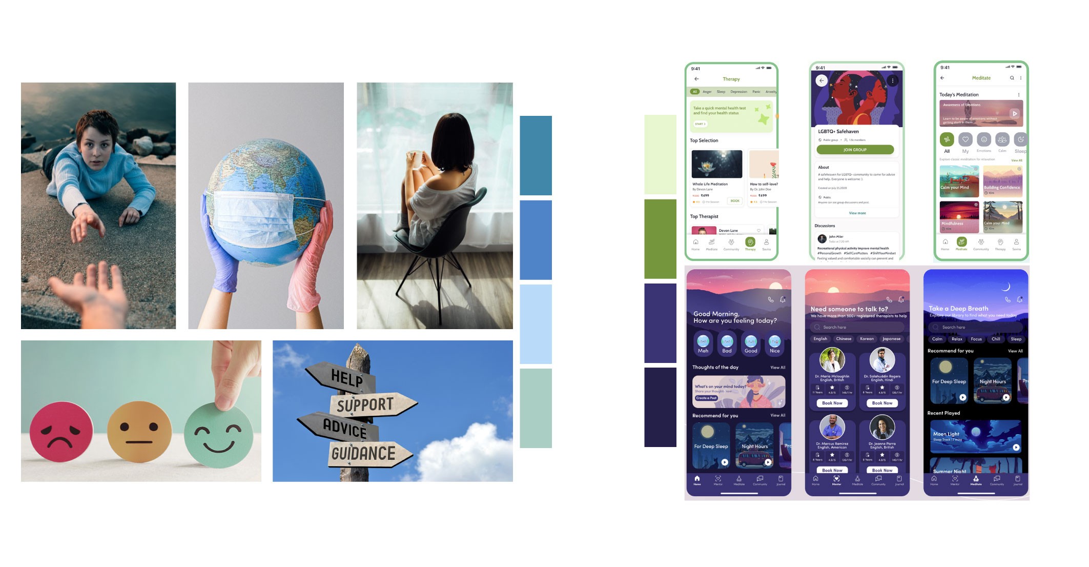
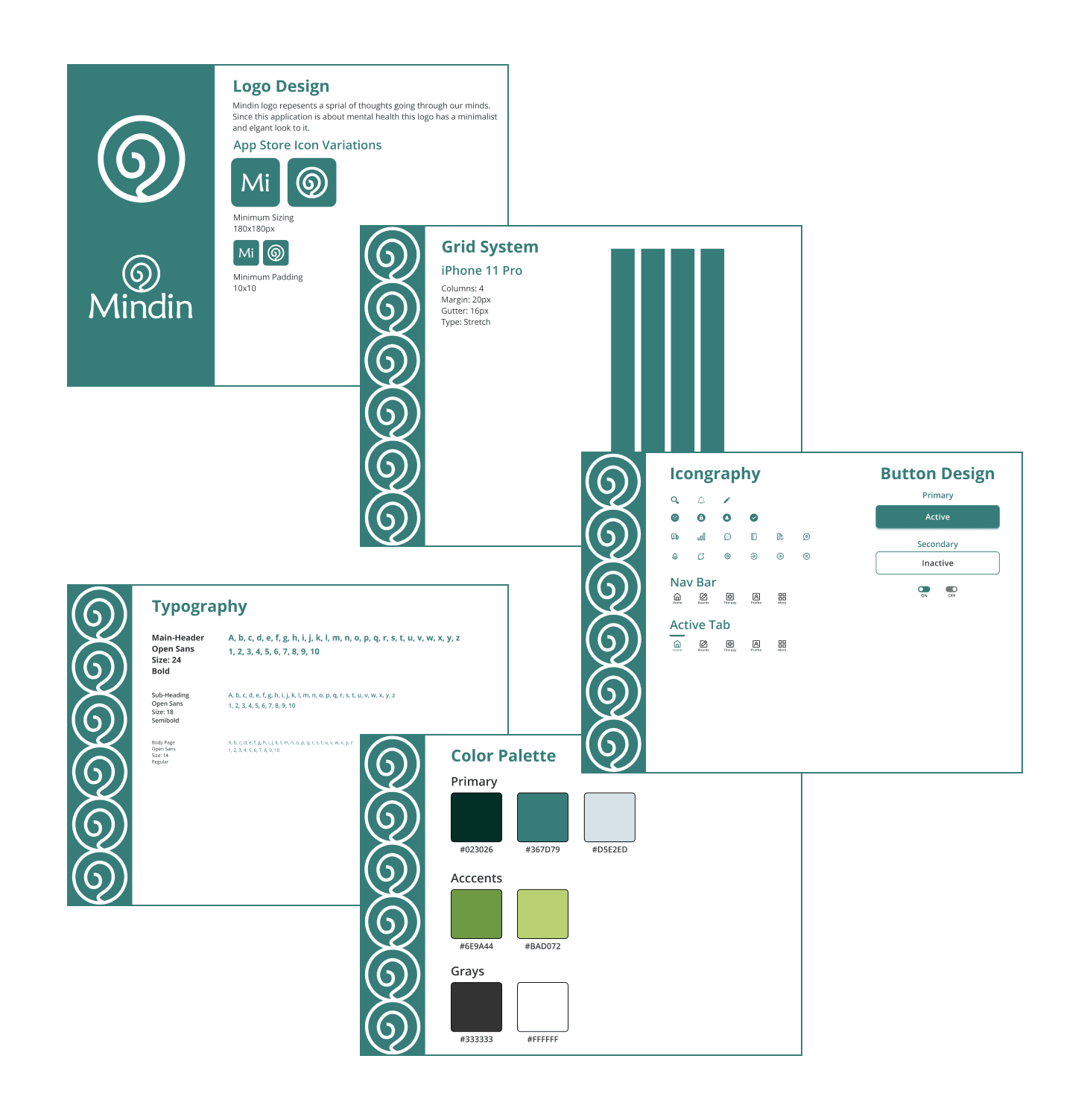
Mood Board & Style Guide
This mood board will help me gather ideas on how to implement styles and colors for my platform. After making the mood board I created a logo, and grid system and I choose the following color palette (#023026, #367D79, #D5E2ED, #6E9A44, #BAD072, #333333, #FFFFFF) for my design. I picked a clean and minimal font (open sans) that goes well with the colors and icons within the app.
High-Fidelity Screens
Designing my first versions of these high-fidelity screens was an exciting experience I went through various drafts of high-fidelity screens before I finalized my designs. I noticed that some screens were lacking a few details. I had thoughts
in my head and I wondered if other users would feel the same experience if they tested my application.
Main concerns:
How does navigating through my app feel to a new user?
Will the user get lost performing certain tasks?
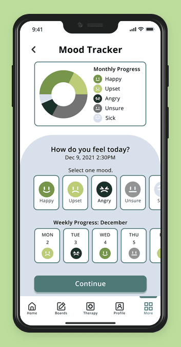
How can I make the mood tracker track a user's moods more efficiently and accurately? but still does not look too jam-packed visually.
Does the user find the payment process lacking options?
Asking myself these questions I decided to put my app to the test. I want to exclude any obstacles when a user navigates through my application.
After creating several different iterations and revising these details I constructed a total of 26 high-fidelity screens that were based on my red routes and wire-frames.


Usability Testing
I needed to understand how other people feel using my app so I recruited 5 users. 1 user was previously interviewed when I did my screener survey questionnaire and the other 4 users were recruited through Discord servers. I conducted a moderated testing style remotely through Zoom. I asked my testers to complete 4 tasks.
Goals:
First impressions of the overall appearance.
Do people understand how to navigate through the app?
Do the community boards make sense?
Do people understand the process of choosing a therapist and
completing a payment?
Tasks:
Creating a new account.
Selecting a mood and sharing a story entry.
Scheduling a therapist and going through the checkout process.
Navigating through the community boards and submitting a post.
Testing results
After each of my participants tested out my prototype the feedback I received was mostly positive but with a few drawbacks. They found my app aesthetically pleasing and received several compliments regarding the color palette I selected for my design. Although my participants still found some problems with the design.
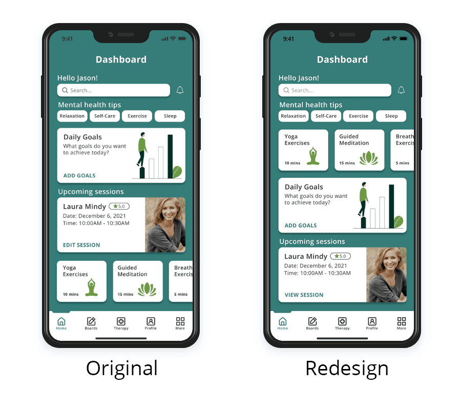
Issue 1: Create a new account
Challenge: Once the participants finished the account creation they arrived at the home screen 3 out of 5 believe these bottom items titled (Yoga Exercises, Guided Meditation, Breathing, Exercises) should be arranged differently to serve a better purpose visually.
Solution: I decided to redesign this section by moving up the items above to make it look cohesive with the mental health tips.
Issue 2: Navigation selecting the mood tracker
Challenge: 3 out of 5 testers mention that the More navigation shouldn’t have the SOS Help listed at the top. They suggest the SOS Help should be moved elsewhere to avoid accidentally going into it.
Solution: I rearranged the More navigation to be listed by order of priority. I moved down the SOS Help and I moved up the Mood tracker to the top since it would be the most used feature in this navigation.

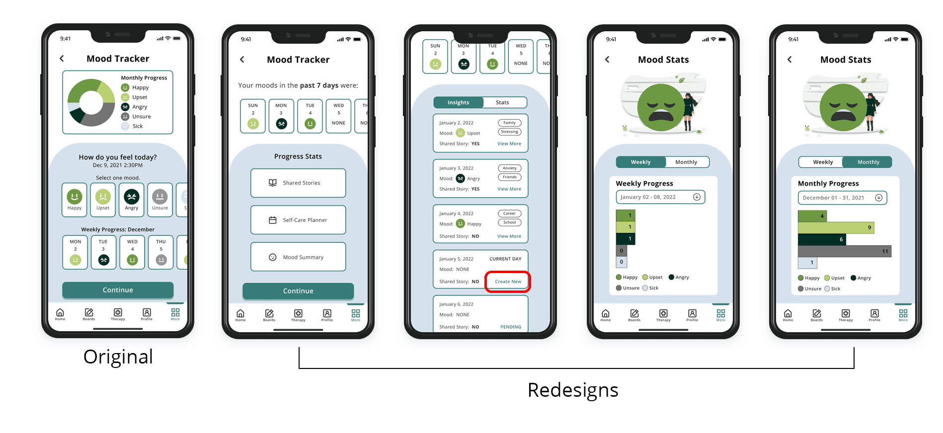
Issue 3: Selecting a mood and sharing a story entry
Challenge: 4 out of 5 users say the Mood tracker's first screen looks a little crowded and overwhelming to see right away.
Solution: A user can select the mood summary from the progress stats on the first screen. The mood summary would show all the dates they have created a shared story and if they tap on stats it will show their weekly and monthly stats. The user can also tap on create new through the mood summary which will allow them to make a new shared story post.
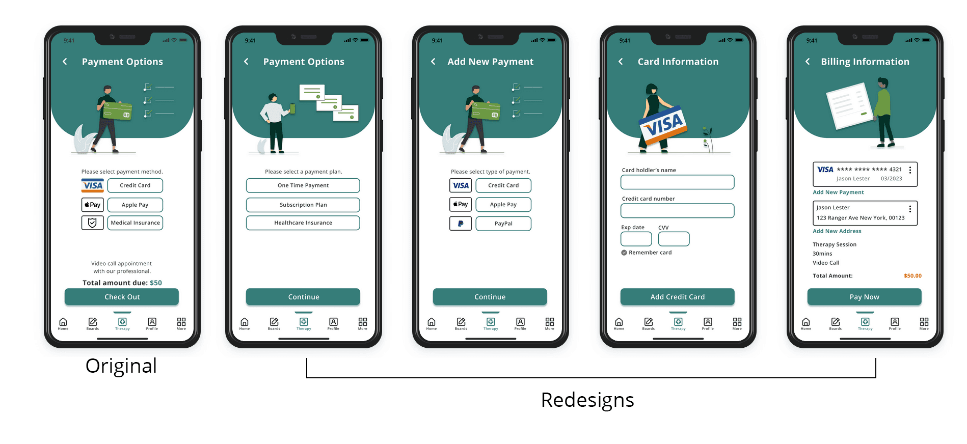
Issue 4: Payment options in the therapist checkout process
Challenge: 3 out of 5 testers say the payment options should show more detailed information about the type of payment plans.
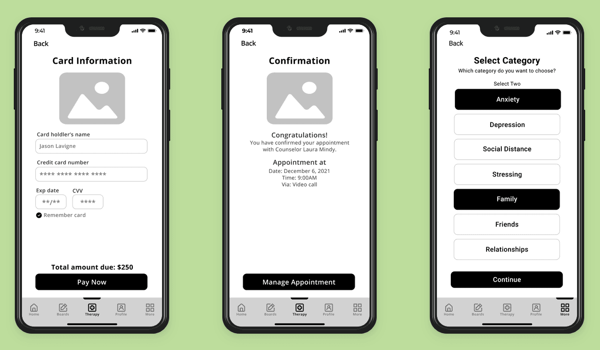
Solution: Add a payment plan feature to give users 3 options (One-time payment, Subscription plan, Healthcare Insurance) now if the user were to select one-time payment it will show them 3 options (Credit card, Apple pay, Paypal) which they can select followed by adding their card information. The next screen added is the billing information screen it shows the user's personal information they have entered to make this purchase possible.
Conclusion
I learned so much more than expected by completing this project. I understood everyone had different reactions and opinions due to this pandemic. Many people don’t realize how important a positive mental health image can help you as a person. My favorite process of the project was meeting all these wonderful people who helped me with my feedback on my design.
Reached the end? Plot twist—there’s more to see!
