TMate HQ
Web app for cloud-based collaboration tool for remote works.
Client: TMate HQ Co-founder Thach Nguyen
Role: Lead UX/UI Designer (Team of 5)
Toolkit: Figma, Miro, Zoom, Usertesting.com
Duration: 12 months
Background: TMate HQ is a cloud-based platform designed to enhance remote team communication and productivity. Its unique virtual office space allows team members to interact and collaborate as if they were in a physical office.
Challenge
TMate HQ wants to enhance their dashboard user experience. The current product isn't fully functional and lacks a virtual office feel. Often times, users find themselves lost and confused on how to start a conversation within a group. They seek a fresh, professional design with an intuitive flow, making remote work more engaging and accessible.
My Impact
I led the redesign of the sign-up flow, subscription plan, and email preview, creating a modern and accessible user experience. My work focused on capturing users' attention while clearly communicating the key benefits of the client's gifting engagement platform, ultimately enhancing both usability and brand representation.
Existing State Analysis: My team and I began by assessing the current product and website to identify areas for quick improvements and long-term fixes, understanding the product key needs. Here are some issues I discovered through heuristic evaluation:
Key observations:
The overall color theme doesn't pass WCAG standards.
Everything looked blank and doesn't look like an office space.
Poor alignment and inconsistent visual hierarchy.
No way to add or remove members from workspaces.
Trouble understanding who's actively speaking on the platform.
Private 1:1 conversations are not functional.
The web browser plugin sticks to the screen and can't be minimized.
Unaware of how to access or see other workspaces in the platform.

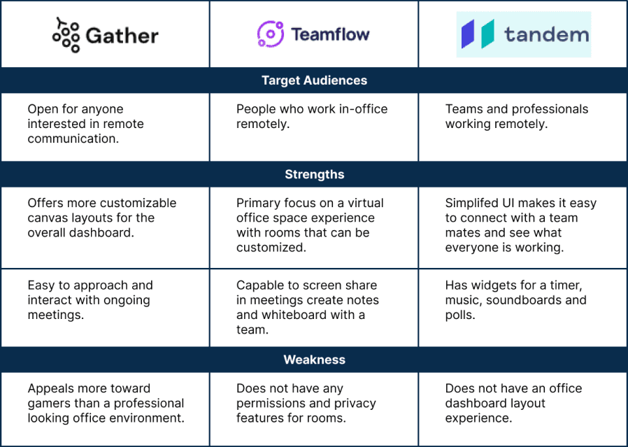
Competitive Analysis
Next, I aimed to explore the functionality and benefits provided by platforms offering similar products. I found 3 competitors similar to the app services TMate HQ provides. Known as Gather, Teamflow, and Tandem while identical, each platform had its unique differences.
Key takeaways from competitors:
Gather has a brand image that appeals more to streamers and gamers. It's fun, friendly, and looks like you are inside a pixel-like video game.
Teamflow has a classy office space environment for a professional setting. It's modern looking and easy to sit down and start a meeting with your colleagues.
Tandem doesn't offer a unique visual environment like the other two previous competitors. Instead, their UI looks really straightforward by selecting the room on the side panel you want to join and then being able to right away strike up a conversation with a team.
User Stories
To plan the next stages of my design process, I created user stories and identified potential functional needs. I prioritized them (High, Medium, Low) while focusing on the goals I want to achieve for this project.

User Flows
As the lead designer, I guided the team in dividing responsibilities based on prioritized user flows to transform the website into a functional product. Personally, I undertook the development of a web browser plugin for expanding and minimizing functionality. Additionally, I mapped out user steps for room joining, issue reporting, and setting room privacy, ensuring alignment with the overall user experience flow.

Wireframes
After defining the user flow, I attempted to create the first set of wireframes to be able to discuss it with my team and some developers. That allowed me to gather some initial feedback. The first round of testing included:
The first round of testing included:
A privacy feature to lock rooms allowing only invited users to attend.
Indications of who is currently talking in the room.
Update icons to signify a better meanings on the dashboard.


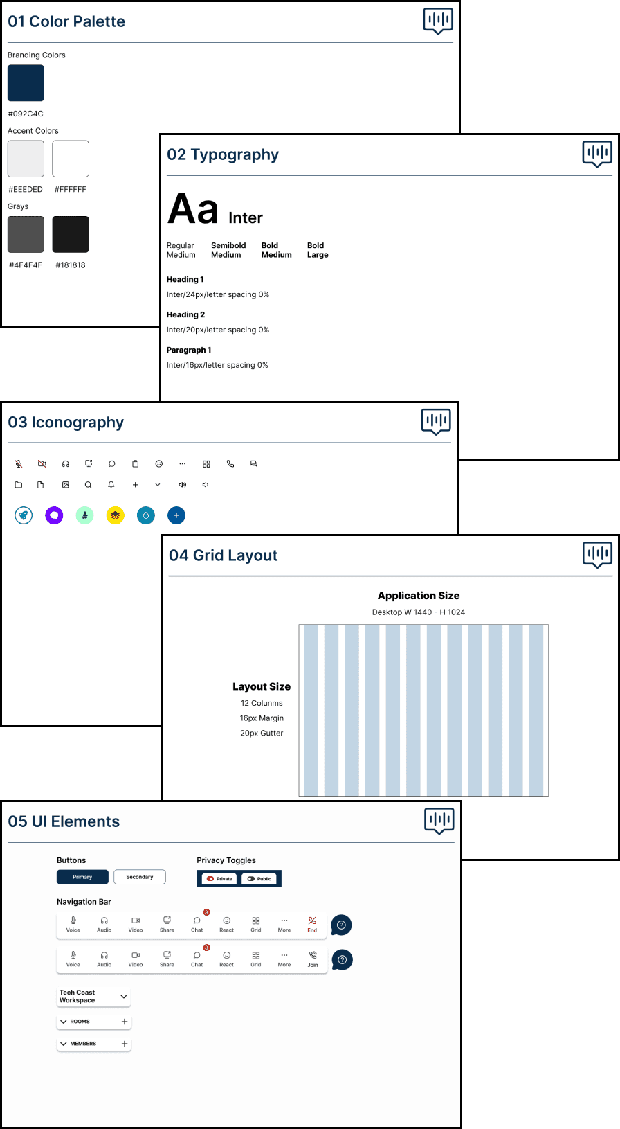
Style Guide
Before starting the Hi-fi phase, I developed a style guide informed by the client’s feedback. Given the client’s openness to adjusting the color palette, I prioritized selecting colors that meet WCAG standards, ultimately choosing a simple navy for the overall brand color. My goal was to ensure the design was accessible for users and aligned with the approval of the client’s development team.
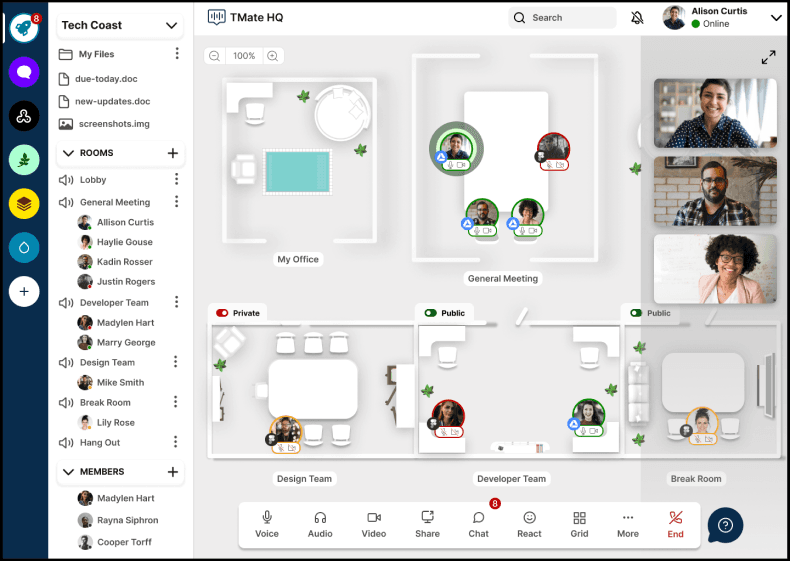
UI Screens
With the feedback received, we can now proceed to build the remaining user flows. The client has requested a few more changes to the join-a-room feature. Instead of a personal office space, he prefers a public room that all members can join upon signing in to the platform. Additionally, he wants to see the design for when users activate their webcams. Another issue to address is the web browser plugin. Our current users find it intrusive and disruptive, so the client has asked us to make it more minimalistic on the browser.
Joining a Room V1
Before starting the Hi-fi phase, I developed a style guide informed by the client’s feedback. Given the client’s openness to adjusting the color palette, I prioritized selecting colors that meet WCAG standards, ultimately choosing a simple navy for the overall brand color. My goal was to ensure the design was accessible for users and aligned with the approval of the client’s development team.

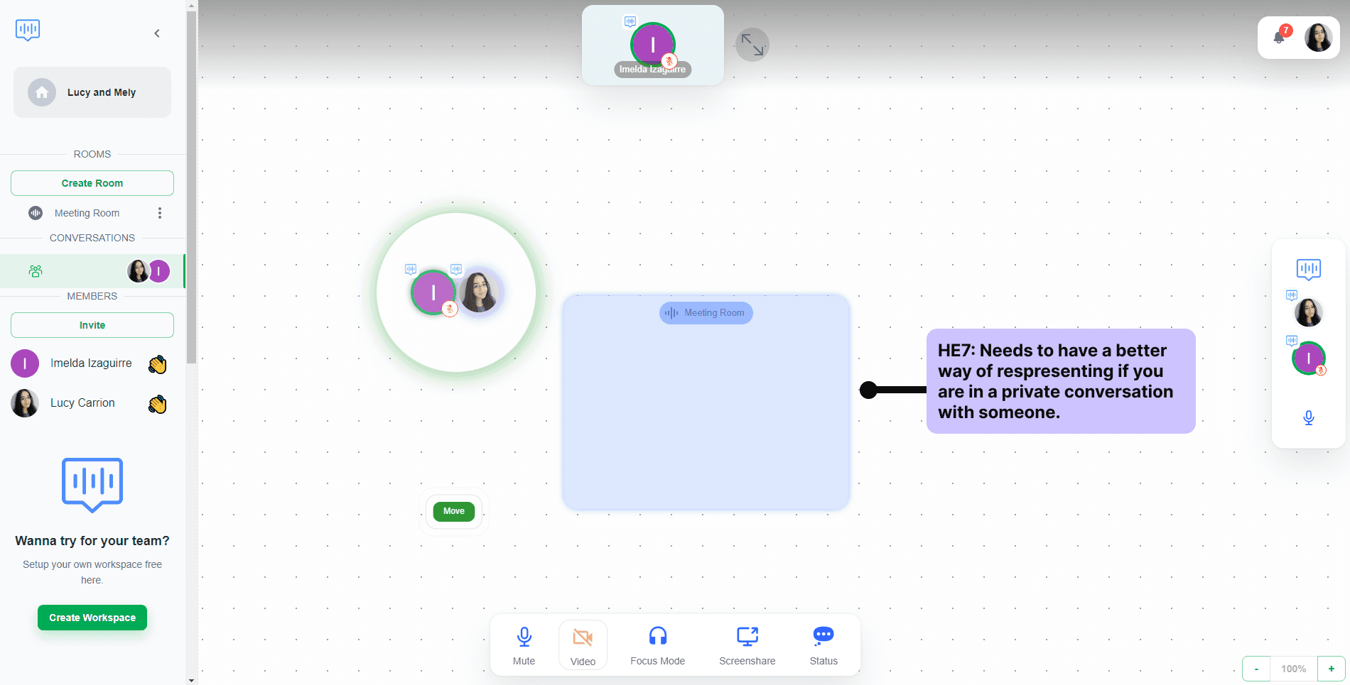
Joining a Room V2
My solution was to change the room name to lobby and this room will be a public room everyone will spawn into when they first click on the join button. I decided to make users appear offline when they first sign into the platform. To appear online, the user must click on join and it will place the user into the lobby and reveal all users working on the board. The clients loved this idea and were happy with the outcome since it won't create several rooms on the board.

Web Extension
Currently, TMate HQ web browser extension can't be minimized and looks too large on the right side of the web browser. My solution was to create an icon with the TMate HQ logo, clicking on the icon will expand the plugin and show more details. Then, clicking on the top right, there will be an icon that will minimize this back into the icon with the logo.
User settings
TMate HQ's current platform has no user settings. I thought it would be a good idea to implement a pop-up menu. When you right-click on a user in the side panel this pop-up menu will be available.

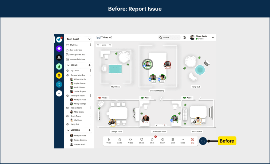
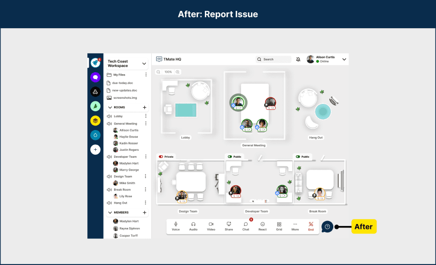
Report an issue
We noticed that TMate HQ doesn't have a report button. This is crucial because the client specified previously he wants to improve their platform by receiving feedback from users. My solution was to create an icon that indicates a report button. Once you click on it, a modal will appear, then the user can input their feedback and submit it successfully to inform problems users encounter in the platform.
Live Prototype: It was time to bring this product to life and make the magic happen. Using Figma, we began linking all our user flows to create a clickable prototype for the user testing phase.
Prototype testing objective:
Overall impression and experience throughout the app
Discover any usability issues
Can users perform all these tasks successfully?
View Figma File
View Prototype
Usability Testing
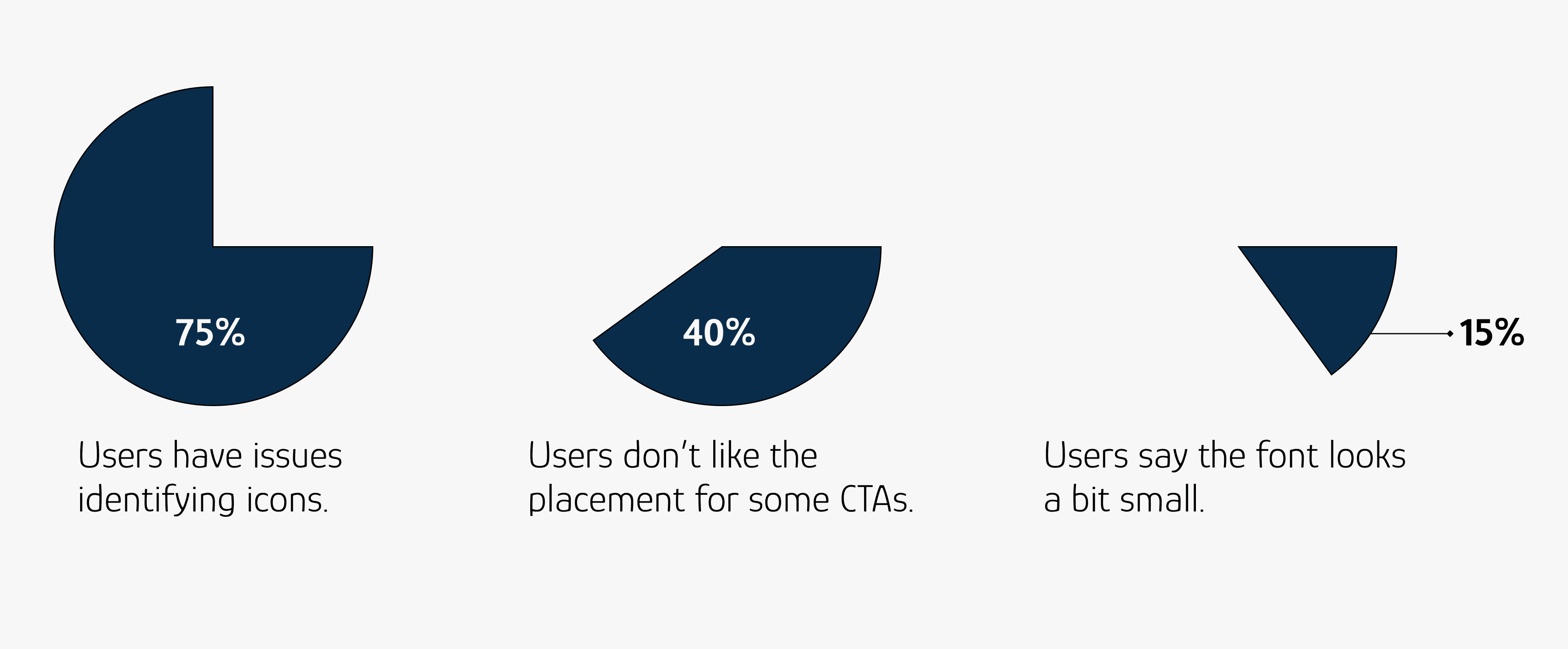
I will be recruiting participants through UserTesting.com for unmoderated user testing. Observing users navigate the app we created was highly insightful. To facilitate this process, I prepared a list of straightforward questions for the participants. However, some users encountered issues that require our team’s attention and resolution.
Issue 1 - High Priority
Problem: Users don’t know to mute other users.
Recommendation: Add a text label indicating when a user is mute it will say unmute and when you click on unmute the label will read as mute.
Issue 2 - High Priority
Problem: Some users don’t understand how to identify who the other user is by only looking at their avatar.
Recommendation: A recommendation to resolve this issue is to create an action when a user hovers over the avatar, a brief pop-up stating the name of the user will appear and fade away after.
Issue 3 - Medium Priority
Problem: Many users weren’t sure how to view all workspace.
Recommendation: Users want to be more aware of where things are located, therefore, we want to have more labeled workspace above the workspace menu.
Issue 4 - Medium Priority
Problem: Overall, users don’t know where to find the report an issue button.
Recommendation: Change the icon to a question mark icon instead of a chat bubble, since users thought it looks more like a chat feature than a report button.
UI Redesign & Comparisons
I worked on redesigning issues 1 and 4. Users were having a hard time understanding if they have muted someone. My solution was to add a text label when a user is mute it appears in red warning text as unmute and when you unmute them it will read as mute in black text. Some users had trouble finding where the report button was located. My solution was to change the icon to a more commonly used report icon.


Design Hand-off
After successfully completing all our UI iterations and receiving client approval, we prepared developer-ready screens. Each of us provided annotations, offering detailed explanations of specific user flows and button placements. Additionally, we included dimensions to help developers understand the overall spacing of the UI elements.


Conclusion
This project was particularly challenging, involving extensive communication with the client and multiple iterations with my teammates. This experience enhanced my involvement as a team player, fostering a strong connection with my colleagues as we collaborated on such an intensive app. As the team lead, I demonstrated my strengths as a dependable designer, ensuring that everyone was up-to-date with the latest client communications to streamline our workflow. We maintained daily and weekly contact to ensure alignment on all deliverables.
